This blog is co-authored with Ine Steenmans, lecturer at University College London (UCL) Department for Science, Technology, Engineering and Public Policy
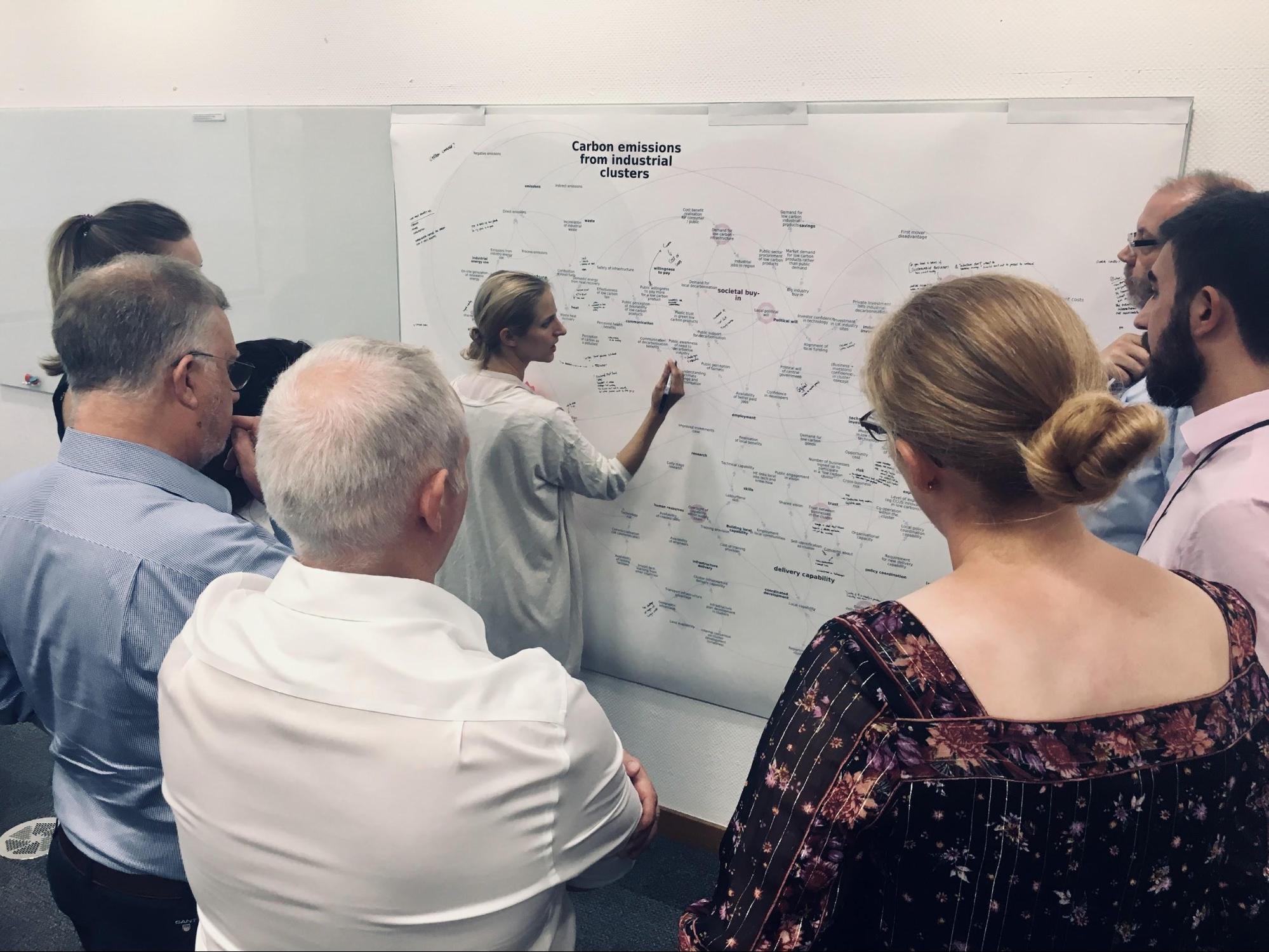
This is the second blog in a short series on methods that Policy Lab has experimented with in the context of addressing climate change. The first blog described a co-design process at the Design for Planet festival which coincided with COP26. This blog focuses on systems mapping as featured in a collaboration between Policy Lab, UCL and stakeholders in the UK’s industry and building sectors (see image above). The project considered options for how to achieve the UK’s net zero target. The blog will describe what system maps are and share five key ways to apply them in policymaking, using the net zero project as a reference. We'll then signpost you to other useful resources to help you get started in your own work.
What are system maps and why use them?
System maps show the different factors that make something happen. They reveal hidden complexity in a visual map. They are intended to be a tool to help people think systemically, and thus they support policymaking which addresses systemic issues.
Government policies aim to affect real world outcomes, for example reducing carbon emissions and increasing jobs. These outcomes sit in a wider system of root causes and effects.
Systems mapping provides a way to identify the structural causes of a policy challenge as well as important additional benefits that may be achieved from a course of action.
From our collaboration on net zero and other work over the years, we have identified five ways of using system maps in policymaking:
- Visualising a system of things that need to happen to achieve a policy goal
- Identifying unintended consequences of a given policy, either positive additional benefits or negative externalities
- Locating reinforcing loops and vicious circles in a policy area which could potentially cause a policy to succeed or fail
- Revealing critical nodes in the system which may unlock multiple other benefits or may indicate where a system is stressed
- Identifying gaps for new policies in a system
These five applications are expanded in the following sections.
Policy application 1: Visualising a system
Different people involved in a policy issue are likely to have different interpretations of the important causes and outcomes. A system map is a visual way of building a common understanding. The screenshots below show how we built a system map collaboratively with the stakeholders for the net zero project.
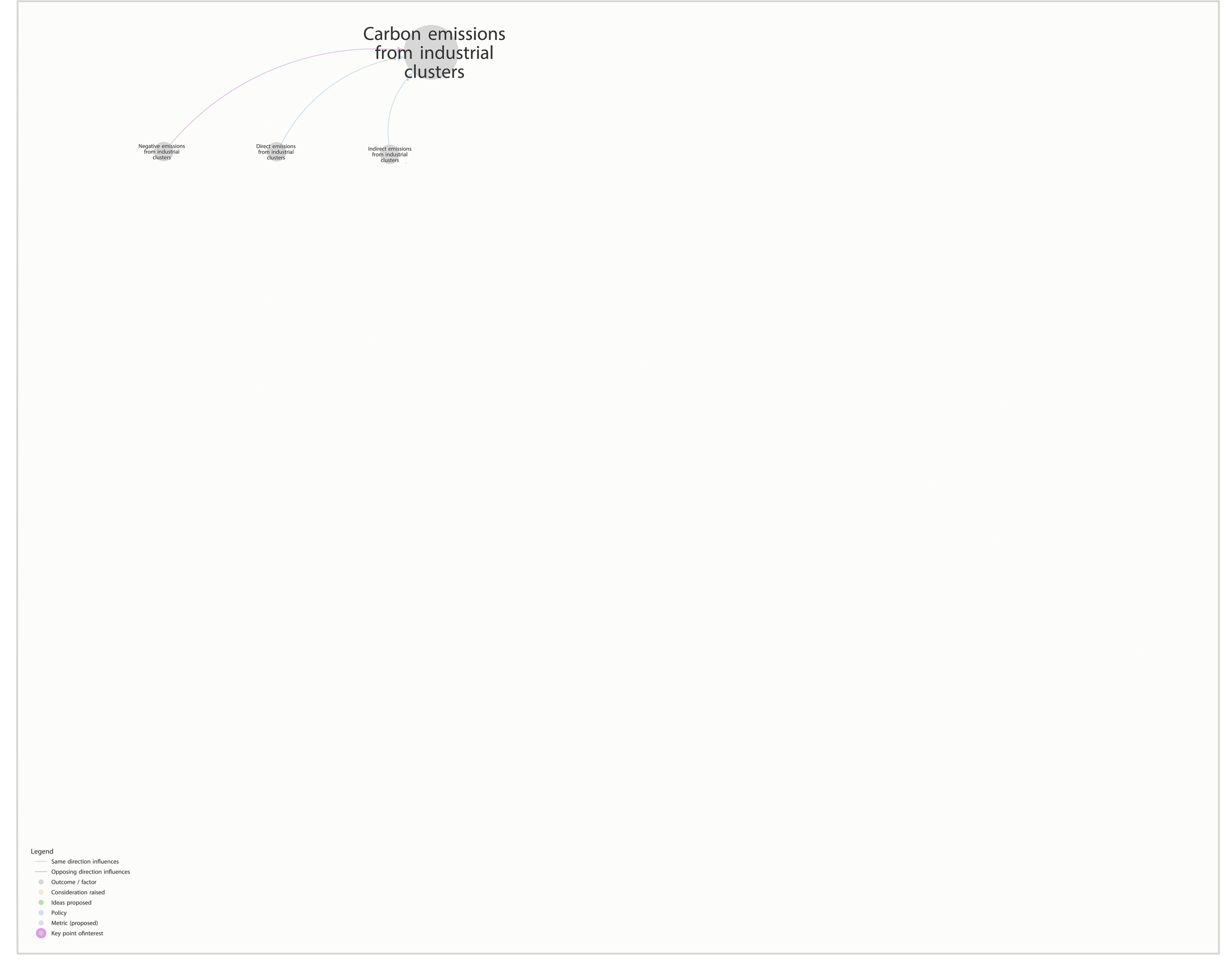
The first step was to plot a key policy outcome, which was reducing carbon emissions, in this case specifically from clusters of industrial activity in close geographic proximity.

Next we asked stakeholders at the workshop to consider what drives this policy outcome - in this case participants identified the following ‘secondary’ factors, shown in the screenshot below:
- Direct emissions from industrial clusters
- Indirect emissions from industrial clusters
- Negative emissions from industrial clusters
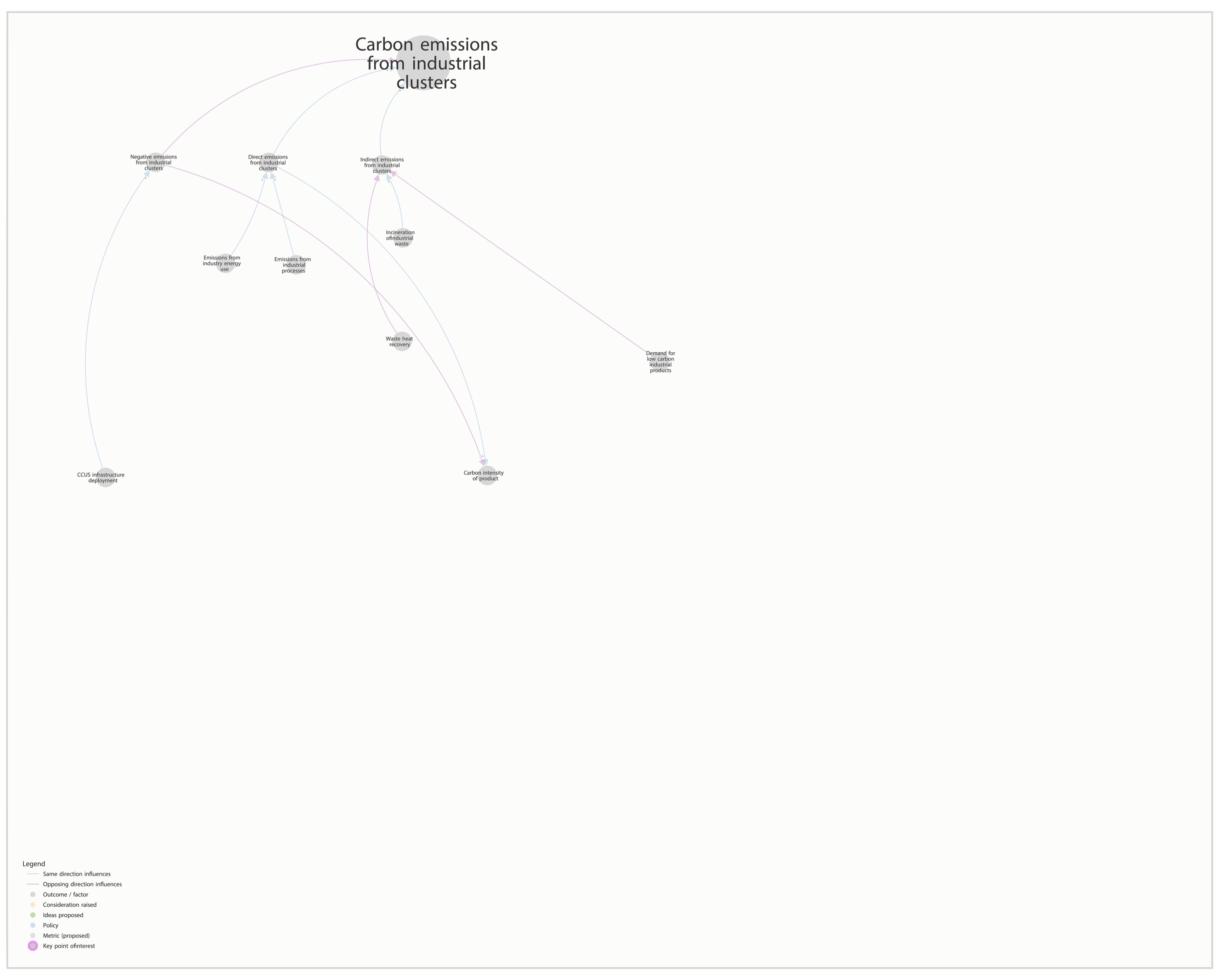
We then invited stakeholders to suggest the different things which might drive those secondary factors. For example they suggested the incineration of industrial waste drives indirect emissions from industrial sectors, shown in the screenshot below.
It then becomes logical to map what affects these tertiary drivers, and so on until we arrive at the full map of the industrial clusters carbon system (see screenshot below).
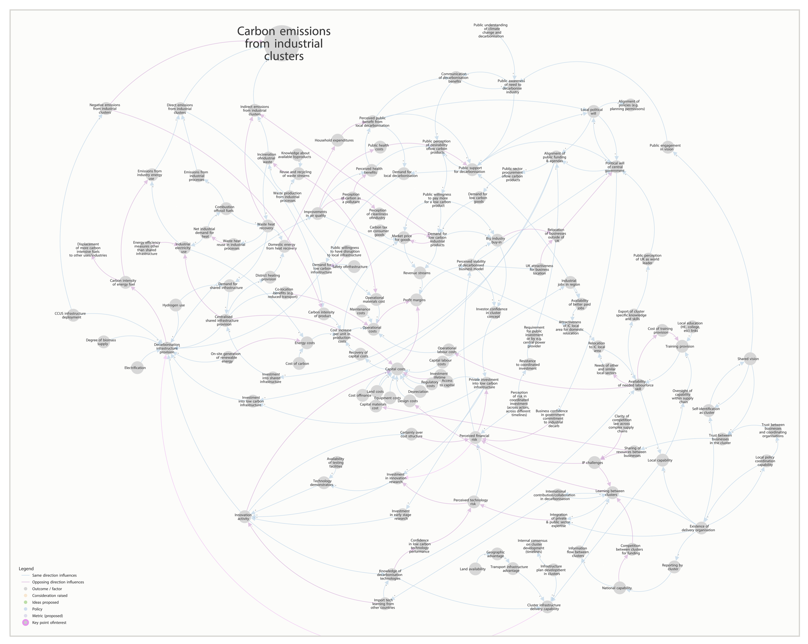
Following these steps helped us to make sense of an extremely complicated and interconnected set of factors which affect emissions from clusters of industrial activity. This particular map was made using a collaborative online tool called Kumu, but there are infinite ways a system could be visualised - we've also experimented with whiteboards, post its and string. But importantly putting something down on 'paper' - making it visual - provides a starting point for surfacing and understanding different perspectives.
Policy application 2: Unintended consequences
An intervention intended to achieve one policy outcome may have knock-on effects on other outcomes. These may be helpful outcomes, often referred to as spillover benefits, or unhelpful outcomes which create negative unintended consequences.
The image below shows an example of a spillover benefit from decarbonising buildings. It shows how better build quality (marked ‘1’ on the image) will drive improvements in the performance of building ‘fabric’, i.e. the materials and components that a building is made of, such as walls, floors and windows (2). In turn, this reduces the demand for heating (3) and thus reduces energy use by buildings (4). These four factors together achieve the primary intended outcome relating to decarbonising buildings. However, in the system map we can also see that improvement in building fabric affects three other important policy outcomes which are not directly related to carbon emissions: air quality in buildings (5), summer overheating (6) and mortality from cold homes (7).
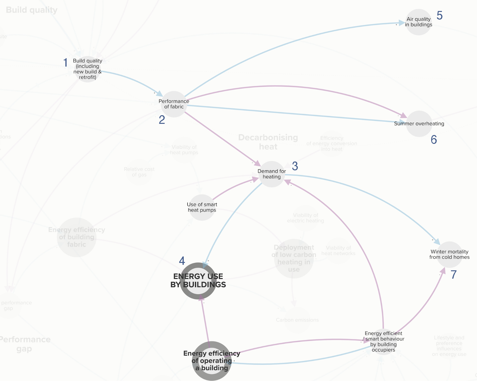
Where such unintended consequences are positive, we may be tempted to think there is no problem. However if such spillover benefits are under-recognised because they do not achieve the immediate policy objectives, then they may be unaccounted for in the assessment of a policy, for example through a cost-benefit analysis. This may mean a given policy is not adopted when it could have had significant positive outcomes for society.
Negative unintended consequences are perhaps more obviously an issue. Such effects can undermine policies in other areas of government, causing a waste of resources and problems for people, organisations and delivery bodies alike. The identification and visualisation of such indirect impacts is the first step in enabling policymakers across the system to take appropriate coordinated action through various policy levers.
Policy application 3: reinforcing loops and vicious circles
A reinforcing loop is where a series of factors reinforce each other; for example, A drives B, B drives C, and then C drives A. Because these relationships are all positively related, they can lead to runaway benefits - or runaway failure. Interventions are likely to fail if they ignore reinforcing dynamics, which is one way of understanding persistent structural or root causes of policy problems. Isolated interventions in one part of a reinforcing loop are likely to have disproportionately high impacts. This is because the initial intervention and its impact are multiplied as this mini system drives itself.
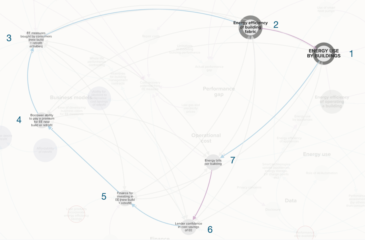
The image above shows a reinforcing loop at the heart of our system map for decarbonising buildings, relating to finance. The critical series of factors are:
- The energy use of a building (1) is affected by the building’s fabric (2)
- Building fabric (2) is influenced by energy efficiency measures taken by consumers (3), which in turn are influenced by the ability to borrow funds to pay for such measures (4)
- However, finance for investing in energy efficiency (5) is partly affected by the lender’s confidence that the borrower will have additional funds available because of the cost savings of energy efficiency measures (6)
- Confidence will come through first hand experience of energy efficiency measures reducing bills (7). But these kinds of examples will only occur when consumers have taken actions to reduce energy use in buildings (1) - and we are back at the beginning of our reinforcing loop
Measures to address this classic ‘chicken and egg’ problem could have disproportionate benefits as once the system corrects it will power itself through this strong internal dynamic.
Policy application 4: Critical nodes
A critical node is a factor which a number of other factors depend upon. The image below shows a critical node in the decarbonisation of buildings, as identified in our participatory mapping sessions with stakeholders: the availability of building performance data (1). This node has a number of other important outcomes notated as 2-8 in the image including, for example, consumer redress if the energy use of the building is not as advertised (5).
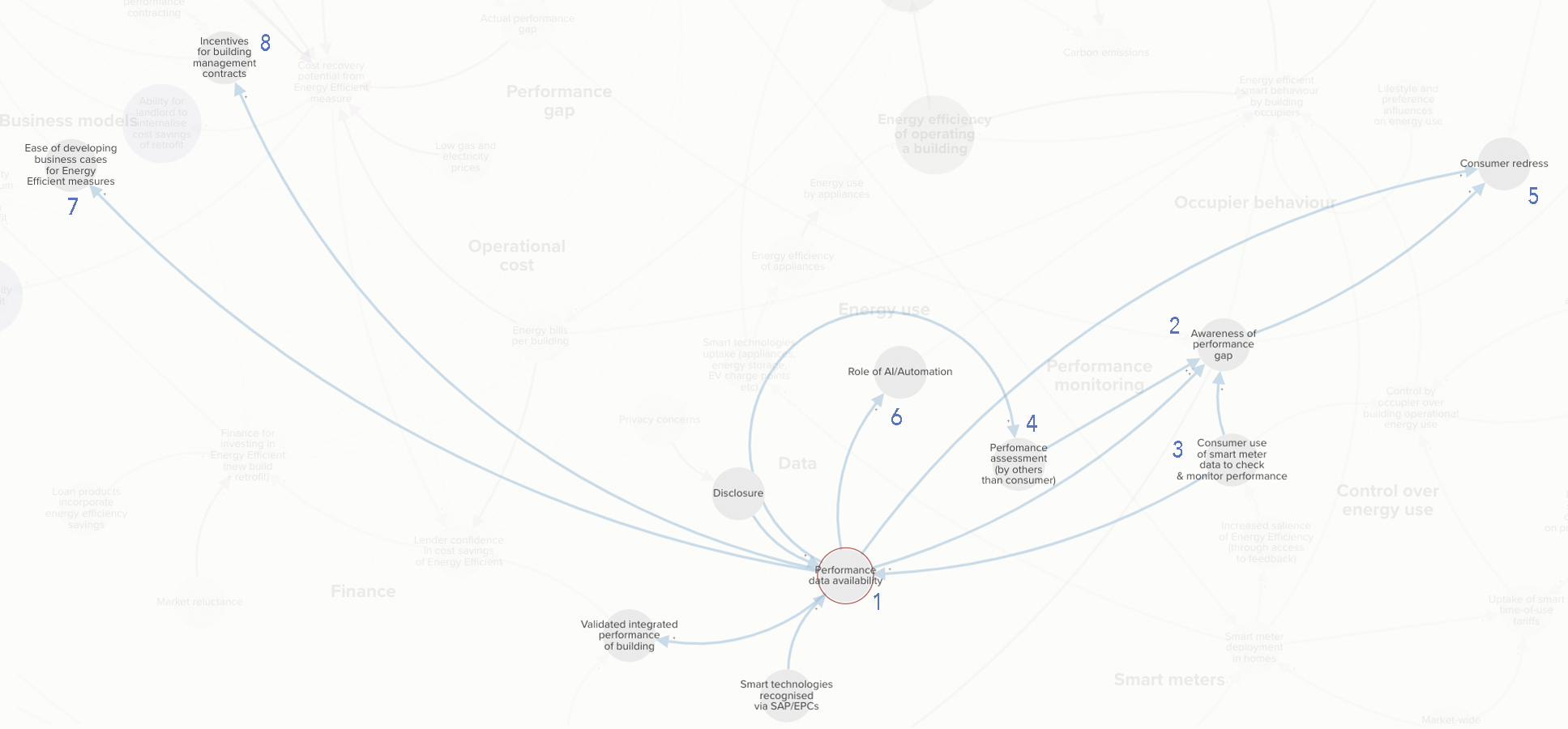
Intervening in a way which affects a critical node is likely to have a disproportionately high impact on multiple important outcomes in a system. Likewise a policy which may inadvertently affect such a node may have significant unanticipated consequences.
Policy application 5: Policy gap analysis
The screenshot below, taken from our participatory mapping session with stakeholders, shows an overlay of policies (green dots) identified by participants as relating to decarbonising clusters of industrial activity. The image is at low resolution, but even at this scaled out view we can quickly visualise possible policy gaps, areas where there are no policies addressing critical parts of the system.
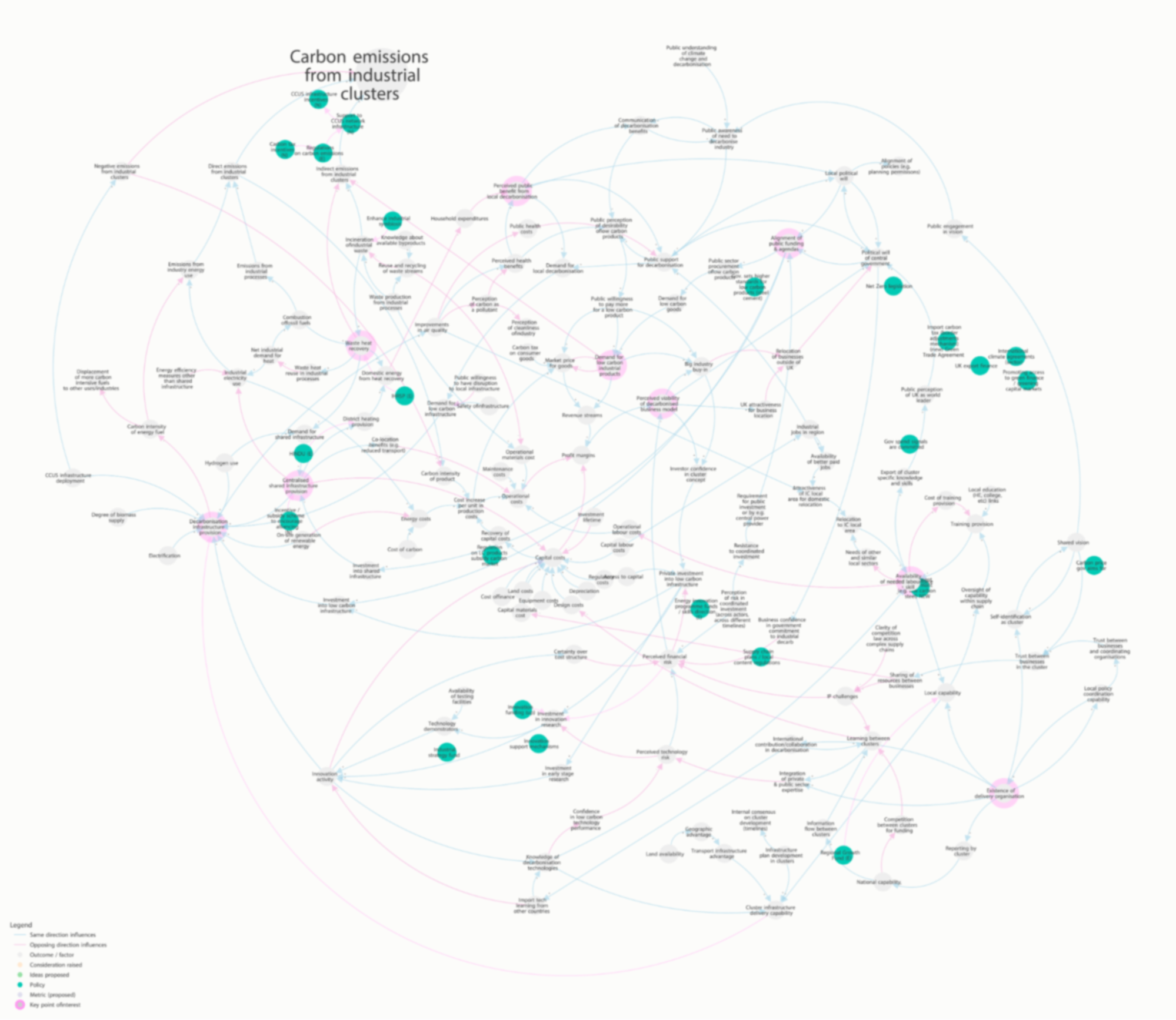
A policy 'gap analysis' can also help identify potential policy duplication, areas where they might be multiple policies trying to achieve the same outcome. This is important as policy duplication risks inefficiency, confusion, administrative burdens or policies acting against each other.
Getting started
We hope this blog has inspired you to try mapping the causes, effects and existing policies in your work area. Perhaps it has given you a flavour of how a systems mapping approach can add value to some of the most complex and systemic challenges facing policymakers today. Policy Lab's work is inspired by innovative practice happening elsewhere - here are some of our current favourite systems mapping reads:
- Ex-Policy Lab design placement Isabelle Ohlson and colleague Heather Madden on how systems mapping is being used in the prison sector
- Adam Groves describes how service design might relate to systems change
- The Royal Society of Arts (RSA) on design thinking to systems change in the context of innovation
- Dark Matter Labs have used systems mapping to focus on systemic challenges relating to building retrofitting in European cities
- For a thorough read on recipes for systemic change, see this e-book from Helsinki Design Lab
- The HM Treasury’s ‘Magenta Book’ on handling complexity in policy evaluation has a useful introductory visual table of systems concepts on pages 12-16
- There is a forthcoming systems toolkit being developed by the Government Office for Science.
Finally, if you are interested in supporting an innovative project exploring the use of techniques like systems mapping in policymaking, please get in touch with Policy Lab.