Bringing data into the design studio; and design into data projects: by Cat Drew, Dr Lucy Kimbell & Stephen Bennett
A couple of weeks ago, we took part in a ‘data studio’: an experimental workshop hosted at an arts university (Central St Martins, University of the Arts (UAL)). The aim was to combine different perspective and skills to create research projects based around data that might help those working to address food poverty in the UK.
The history of interplay between data and design is longer than one may suspect. Since John Snow or Charles Minard in the 19th century, information designers have been presenting data in informative and often beautiful ways to tell stories and solve problems. The UN Global Pulse has been using data to address humanitarian aid issues, whilst initiatives such as the ODI/Nesta open data challenge have inspired services with open data at their core. The CSM data studio provided a new slant on this tradition: using design methods to create innovative data-led projects. Our hypothesis was that the design ‘toolbox’, traditionally found in the art studio environment, can be applied in a research context to generate insights for policymakers.
We were there because we are interested in ways of supporting policymakers to use new types of evidence and data. The UAL Innovation Insights Hub is investigating how the analytical approaches associated with data science can be combined with the ethnographic methods more commonly used in design that start with people’s experiences and behaviours. Policy Lab has been applying this combination of techniques to policy problems such as preventing homelessness or supporting people to manage their health conditions. GO-Science is interested both in supporting departments to use more data science techniques (for example powerful predictive models or alternative data sets) and also encouraging novel ways of turning evidence into policy .
The two day ‘data studio’ took an explicitly design approach to creating some ideas for research projects focused on the strategic and operational challenges of increasing food bank use in the UK. The event incorporated techniques from the design school it was situated in: exploring food poverty from different human perspectives; making physical mock-ups of aspects of food poverty; wire-framing potential research designs. The data studio brought together people from a range of disciplines: data scientists, designers, policymakers, people from local government, sociologists and people working in food banks. Each discipline had different understandings of food poverty – this necessitated developing a shared language for talking about ‘data’, ‘insights’ and ‘methods’.
As well as the insights relating to food poverty, three general observations from the studio may be useful for using data and design approaches tackling social policy issues:
- Design provides an excellent translation mechanism for interdisciplinary perspectives. This is important when trying to create projects where different types of expertise are held by different members of the group. Physically making things allows people to create a shared understanding and new insights.
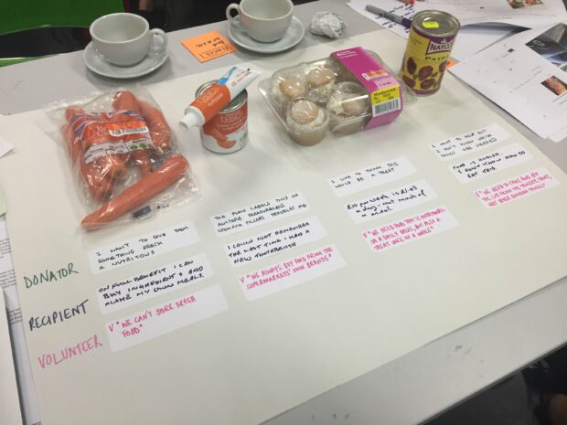
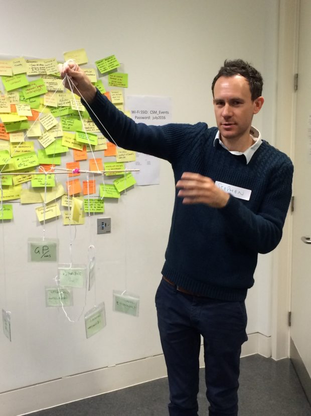
A recurring feature of the studio was the making of physical artefacts. An initial task was to create a physical data visualisation that revealed insights into food bank operations using information about food poverty, some of which was provided by the Trussell Trust. Each team was given different materials. One team used items of food that people might donate to the food bank: this stimulated insights around how food provides a connection between the donor, the recipient and the food bank volunteer. Yet it also indicated that each individual may view the same food in different ways: a donor may give fresh carrots for their nutritional value, but a recipient might not know how to use them in preparing meals, whilst a volunteer might not know how to store them. Another team was asked to create a map of the organisations referring people to food banks, using only string and clips as materials. The process of making this three-dimensional dynamic model sparked conversations and created new insights about hierarchy and interconnections between different referring organisations.
Experts were denuded of their traditional tools of analysis, and instead provided with best-before-display cupcakes and reduced carrots. This forced newly formed teams to emerge from their traditional disciplinary bunkers and listen to each other and new ideas.
- Design emphasises the human aspects of analysing and using data. It reminds us to properly ‘design’ the interactions around how the data is collected from users and how the insight is used by service providers.
If the first task used design to better understand food poverty, the second focused on using design to better co-create data projects. Design allowed us to think beyond the data and computational techniques, and to start with the problem and practical issues. How would data be collected from users? How would insights be used by the audience?
Our design lens helped us understand that data collection itself is touch point between users and services: better design can help the process of data collection be an experience that creates trust and empowerment. This is important because a data science project does not end with the insight it creates; it needs to lead to decisions or actions.
As an example, the “cup of tea moment” is an important part of the food bank ecology – it is where volunteers and food bank users build trust in a familiar social setting. One team focused on how qualitative data could be collected by researchers sitting in this setting, to supplement the quantitative data collected through other routes. Another team suggested that the cup itself could relay information that could help people change their own circumstances, including guidance for individuals who were experiencing changes in benefits or sanctions.
- The workshop helps to develop data literacy within the policymaking community, including local government. It improves capacity for co-designing data science projects.
The workshop enabled reflection on the way we create data science elements of Policy Lab projects, with the overall aim of getting policymakers to become curious about generating new evidence in this way. From the perspective of Policy Lab there are a number of lessons:
- Policy Lab has so far focused on user-centred techniques, such as personas and journey maps, to help explore alternative data sets that people generate about themselves. But we also need to spend more time thinking about the data that the organisations already collect, and indeed data that exists in the wider data ecosystem (similar to how the UN Global Pulse tools act).
- Design is a great leveller in getting teams of different types of expertise to work together. But there is also a need to port in expertise which may not be ‘in the room’. Often this can mean raising awareness of the technical possibilities of data science. In Policy Lab, we use a set of data science inspiration cards, whilst the CSM ‘data studio’ incorporated presentations about successful data science projects. Having some easily accessible examples of the different data analysis techniques – predictive modelling, k-means clustering, text analysis, sankey diagrams – would ensure that all experts are up to the same speed.
- Often the biggest barrier is not creating a data project, but knowing what data is available. Further work upfront, to establish what data is available and whether it is from open data sources or certain organisations, would greatly facilitate the process of creating new projects. Data available in the studio – even as dummy data – also helps. Perhaps the overall lesson is that quickly making and showing something digital creates enthusiasm to move the project forward in small practical steps, using what is available now rather, than getting bogged down in different processes of data acquisition.
The data studio drew on the skills of 30-odd people, from a range of professions, to create seven ‘proto-projects’ for the Trussell Trust to consider. Beyond this, we experimented with more ways to bring data – and all the possibilities, insights and efficiencies it contains – more firmly into the toolkit of the policymaker, whether at local, national or community level.