Over the last few months, I’ve been asked to talk about data and design a lot. Last week I returned to my old uni, London College of Communication; last month I shared my thoughts with South Americans at the e-xperience conference in Medellin; and in September I was privileged to kick off TedX Westminster at the Soho Theatre. This is an emerging intersection and each time, the opportunity of the talk gives me a chance to reflect on where the practice is going.
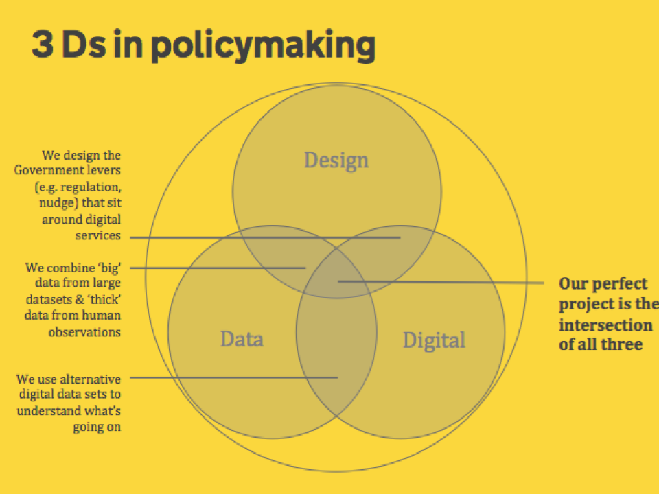
In Policy Lab, we talk about the three Ds of policymaking: data, design and digital. We think about how we can combine them: designing the other Government levers (e.g. regulations or nudges) that sit around or as well as digital services; combining big data from large datasets with ‘thick’ data from human observations; and getting non-traditional data from digital interactions to have a better, real-time sense of what is happening.
Over the past two years, we have been using data and design in what appears to be three main ways: designing data, designing policy with data and designing data-driven public services.
Designing data
Civil servants live in the world of words and numbers. But these are often extremely complex and time-consuming to interpret. In the Home Office Strategy Team, I remember wading through enormous slide packs filled to the brim with charts, graphs and tables. Design can make data much more accessible and easy to interpret, allowing us to open up policymaking and invite others into generate ideas. In our future of ageing project for GO-Science, we worked with Data Design to turn a 200,000 word review of the academic literature into data cards, which we used in a workshop activity to help policymakers to explore the data relating to specific challenges. We also used the evidence to create personas which Hugo Yoshikawa illustrated for us. This was an important moment in the workshop. It really humanised the evidence and the policymakers could really start to imagine what people’s experiences would be like in 2040. GO-Science have been making these tools available for other non-Government organisations, in the UK and internationally to use, and we’re embarking on a new project - this time on waste with Sophie Thomas who led the Great Recovery design project at the RSA.
Visualising data well can not only help policymakers, stakeholders and frontline staff make better decisions, but it can also engage the public. The Office for National Statistics has started creating topical and playful data visualisations, such as this one about babies born on Halloween or this quiz about teenage pregnancy (I was hopelessly wrong).
Data made open and accessible can also be a policy in its own right, nudging people’s behaviour or prompting people to advocate for change. The red/yellow/green food labels allow us to decide what food to eat to stay healthy. Opening up cycle accident data helps people to plot safer routes to work. Crime maps help citizens hold their local police to account - and in the more commercial space, Anna Powell-Smith’s excellent ‘What size am I?’ allows people to see what dress sizes high street shops stock, and complain if they are too limited.
Designing policy with data
The civil service naturally places a lot of emphasis on evidence-based policy, so using quantitative data to develop a policy is nothing new. But the type of data and ways that computers can analyse it are. The Government Data Science programme has been set up to promote the use of data science across departments, and we have been combining it with more qualitative evidence in our projects.
Our health and work project with the joint Work & Health Unit (written up fully on page 36 here) has been looking at how we can support people to manage their health conditions and stay in work. We used data science techniques on the Understanding Society survey to understand the risk and protective factors for people who report to be on a health-related benefit. It confirmed many of the risk factors we knew about, but also revealed some new insights for example that bereavement was a risk factor and that women with clinical depression are less at risk than men with the same condition. But on its own, it was not enough. We needed to combine it with graphic design and design ethnography to get the full value.
The Sankey diagram was a great way of showing that once people flow onto benefits, they do not get off. But the visual output of the k-means clustering (grouping those on health related benefits into 5 groups based on known risk factors) was more difficult to interpret. The full insight became apparent when Laura Malan from Uscreates placed the the segments on an axis of good-poor health and high-low previous salary. Then it became crystal clear how different groups were, and how they would have different motivations and needs for returning to work, and therefore different policy interventions.
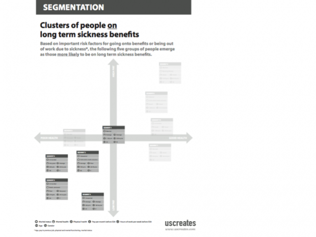
The data science showed that people who were in their job for a short amount of time were more likely to go onto health related benefits. The ethnography revealed why: that it was the relationship between the line manager and employee - which builds up over time - that was critical.
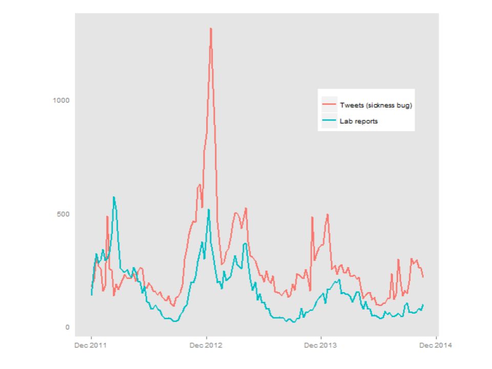
In this project, we used a fairly traditional dataset, but increasingly, Government is looking to other digital datasets to make better policy decisions. The Food Standards Agency has created a predictive model for Norovirus outbreaks based on Twitter feeds, and IBM redesigned the bus routes in Abidjan, Ivory Coast to reduce travel time by 10% by using 2.5 billion mobile phone records to find out where people were travelling to and from. Using digital data provides real time insight, but we have to make sure we are doing so in a way which is appropriate and maintains trust, which is a the subject of the Government's ethical framework for data science which we developed in an open way earlier this year.
Designing data-driven public services
As way as using data to inform better policy decisions, it can also be the basis of services - for example using data to predict and identify those at risk, and providing services that are tailored to that individual.
Our homelessness project with DCLG explored some of these issues. As with our health and work project, we combined data science with film ethnography. The data science (this time using the British Birth Cohort Survey) showed that we could predict homelessness. There were 10 key childhood predictors of homelessness in later life (especially being in care and truanting) and being in the 20% of the country most at risk made you 15 times more likely to become homeless than the 20% least at risk. But the ethnography also revealed other protective and risk factors - such as resilience, support network and resourcefulness - that are not captured in the data because we don’t ask questions about them.
We’re now working with DCLG and ASI to put on a data hackathon with local authorities to develop some better predictive models for identifying those at risk and intervening early. Inspired by Dr Lucy Kimbell’s data studio, we’re taking a design approach and making sure that we think about the human interactions either side of the data science. We need to think carefully about how we collect the data in the first place, how we do so in a way which is trustworthy, but also considering how we could use this interaction to nudge people to think about their strengths and resilience. We also need to think about how the predictive data is then interpreted by frontline staff - making sure that they feel empowered to use this insight along with their other professional expertise - and then used to have an effective first conversation with the person identified as at risk.
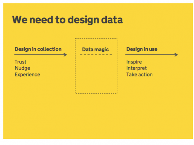
In all these examples, it is not just a case of putting the data out there. It needs to be properly designed, whether that be visually communicated, combined with a qualitative and human understanding of the world, or applied in the context of trustworthy, empathetic and supportive services.
If this is important now, it will become even more important in the future when we generate more and more data and we’ll have data-driven possibilities like automated vehicles, remote healthcare monitoring technology and artificial intelligence (AI) driven courts. This is my way of thinking about how we are combining data and design now, but I’m not expecting it to stay this way for long....